In simplest terms, a logo is a symbol or design adopted by an organization to identify its products. But the idea of using colors and shapes to communicate a message is nothing new. The creation and use of logos can be traced back to the Middle Ages [and earlier]. In medieval Europe, the system of heraldry assigned design elements and unique color combinations and shapes to noble families in the form of a crest. The use of symbolic language also emerged as society developed to include diverse trades. The cross came to represent the practice of medicine while barber shops sported striped poles.
Twinings Tea has used the same logo — a capitalized font beneath a lion crest — for 227 years. Bass Brewery is credited with trademarking the first logo. In 1891, Marcus Samuel and Company began shipping kerosene from London to India. The company also collected seashells on its trips and sold them in the European markets. The side business in shells was so popular it soon made up the bulk of the company’s profits. In 1897, Samuel incorporated the name “Shell” and established the mussel shell as its logo. In 1904, the mussel was replaced by a scallop shell which became the official logo. Three years later, Shell merged with the Royal Dutch Petroleum Company, but retained the scallop shell logo. The oil company opened its first service station in California in 1915 and introduced the red and yellow color combo we see today at Shell gas stations across the country. Shell has a market value of almost $260 billion and is considered one of the world’s largest energy companies.
Paul Rand was an American graphic designer and art director known for his corporate logo work, the likes of which included IBM, UPS, Westinghouse and ABC. He said, “A logo doesn’t sell (directly), it identifies."
Rand was right. Whether it’s through a company’s website and social media, a business card or booth at a trade show, a logo communicates a first impression. It’s also used to build brand loyalty and distinguish a company from its competition.
Last week we introduced you to Creative Composites Group, a new organization that we are now a part of. The development process for our logo challenged us to dive deep to think about what our brand position is, what message we want to convey and why we think our customers should believe our message.
Sounds like a lot doesn’t it?
From a manufacturing perspective, fiber reinforced polymer (FRP) composites have come of age. We’ve entered an era where very light, very durable, corrosion-resistant, FRP products have become the manufacturing and construction material of choice. And because CCG combines the strengths, manufacturing capabilities and unique product lines of five companies, we know that when we say we can take the boldest ideas and turn them into a reality, it’s the truth.
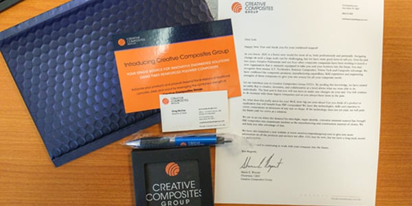
After considering a number of designs, we settled on a logo called Ripples. If you look close, you can see the initials of our name in the design. Overall, the logo signifies a circle which is a complete and enduring form. Its lines or “ripples” emanate from a point, communicating growth but also our desire to have a positive impact on our industry and our customers. Lines tell a story about the layered nature of our group in terms of the depth of our product lines, engineering expertise and combined strength.
Most designers agree that a logo should be simple, unique, versatile, memorable and relevant. We think our logo meets those objectives. We’d like to know what you think so give us some feedback. In the meantime we’re going to be busy continuing to earn your business and showing you through action and example that nothing is more important to us then helping you reach your goals.
